
UTAH VALLEY UNIVERSITY
Brandish App
November 2020
The Problem
With the proliferation of mobile and social media platforms, there is no longer
“one size fits all” for publishing digital content. To reach a wider audience, digital publishers must
make their content adaptable across a variety of platforms.
In my Adaptive Media Experiences course, I was tasked with creating a business persona
and adapting this persona’s content across multiple platforms. I created Brandish, a would-be marketing
resource, that features content about how to build a brand from the ground up.
Deliverables
High-fidelity prototype
The Solution
Research
Early in the semester, I reviewed what branding/marketing apps are already available. I found
multiple sources that provide marketing services,
such as consulting from Brandology or business card
design from Brandly. One of the more well-known
brand-building platforms, HubSpot, provides some
marketing resources and methodologies, but focuses
on inbound marketing, sales, and service software.
Many digital publishers take a DIY approach to
marketing—at least in the initial stages of growing
their brand. Brandish content, specifically the Brandish
app, is designed to take the user through the process of
building a basic marketing plan—focusing on foundational marketing
concepts rather than the mechanics of tracking leads and
sales. Once the user has the basic concepts down, other
Brandish platforms, such as social channels, provide a flow of
ideas and tips to hone their marketing efforts.
I was stumped when it came time to pick a name for my persona.
It seemed that all the variations of the word “brand” were already
in use. I wanted something bold that would stand out from all
of the trendy or obvious choices like "brandily," so
I searched online thesauri and talked with friends and family
about my ideas. The word “brandish” was proposed. This felt
like a winning combination of the word "brand" paired with the bold concept of "brandishing."
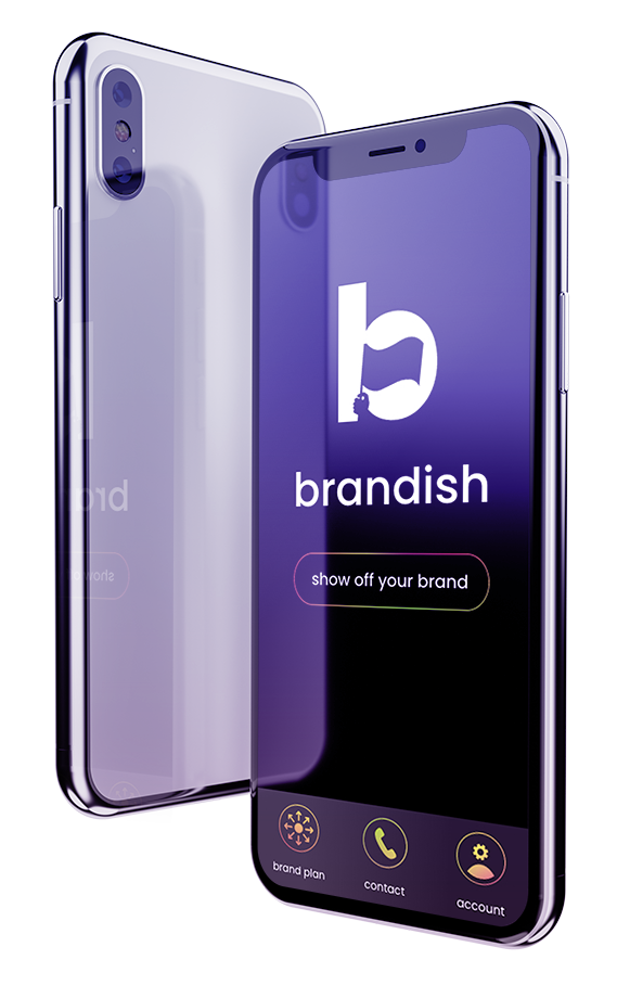
I selected Brandish with the tagline, Show off
your brand, and a longer tagline for use on mediums such as a
podcast: Is the world ready for your brand? Don’t promote it.
Brandish it.
Ideation
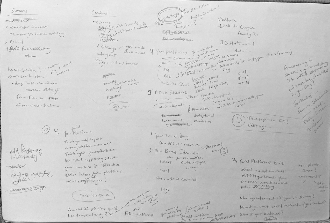
I began the ideation process by sketching, and progressed to low-fidelity wireframes. With each iteration, I added more layers of content from my research to build a richer experience for the user.
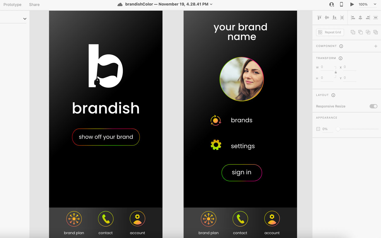
When I was building my business persona, I created a negative space logo in black and white. I love the simplicity of black and white and this high-contrast color combination feels clean and bold. I used black and white as the app’s color scheme for the reasons listed above and to maintain consistency with the Brandish brand.
Ui Design
Prior to this project, I’d spent months working
on UVU websites which feature pre-configured
elements. Since it had been a while since I designed from scratch, I had some questions about mobile
dimensions. I availed myself of the resources
provided by InVision and Kapeli’s iOS cheat sheet.
I made some slight modifications to the recommendations
in order to create content hierarchy, but it felt
satisfying to base my design off what users are familiar
with and what has worked for high-level designers.
Doing a little research took a lot of the guesswork
out of the design.
Once I had the dimensions down, I started on the
navigation. Traditionally, a popout menu is featured
in the upper corners of a mobile app. I’ve frequently found this
menu difficult to reach while navigating on my phone.
I have a minor skeletal malformation called Brachydactyly
type D or “stub thumb.” The last section of
my thumb is stunted, making my thumb shorter than average.
This condition is sometimes called “toe thumb.” Imagine
navigating an app with one of your toes! Okay, it’s not
that bad, but it does make reaching that corner menu harder.
I decided to do some more research on mobile navigation and
came across an article by UX designer Kiril Karov about
reinventing app navigation: “One-handed Use of Tab Bar/Bottom
Navigation — Best Practices for Reachability.” Karov talks
about how a majority of users navigate using their thumb,
making it difficult to reach the menus located in the upper
corners. With this in mind, I designed
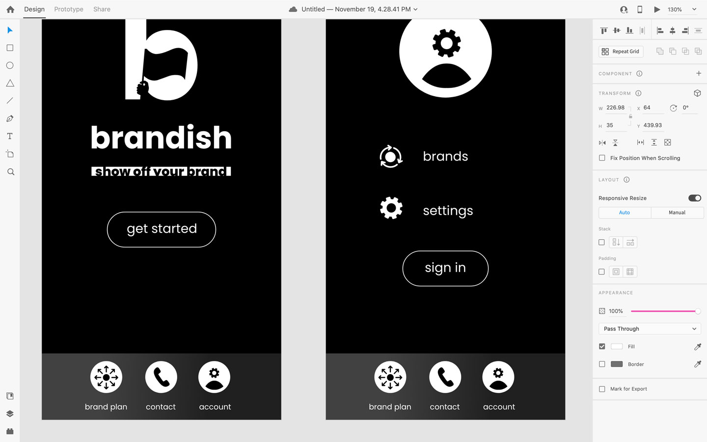
a bottom navigation menu. This app only has three menu
items—if additional items were needed, a menu that pops out
from an ellipse icon or the word “more” could be used.
Iteration
This app was intended to be simple, but some of the
sections featured too much information for easy
navigation. I hid some of the content so that the
user could choose to progressively disclose
content at their own pace.
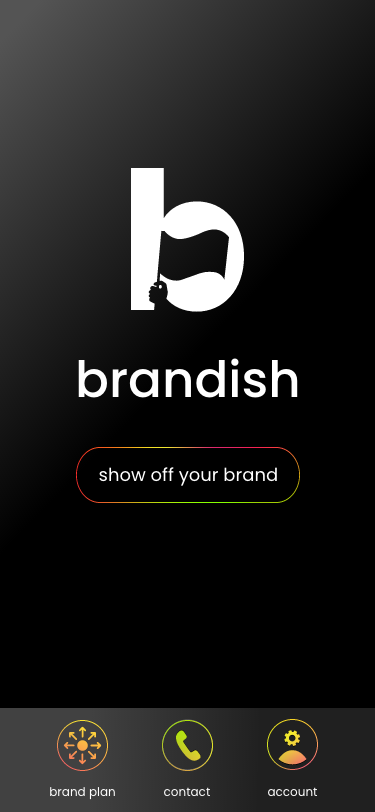
Black and white is bold, but the app’s UI didn’t say
“brandish”—it felt cold and a little flat. I added
some pops of neon-colored gradients and a background
gradient to add some warmth and texture.
Lessons Learned
It was eye-opening to design the user experience
around a problem I encounter on a daily basis. Navigating on
my phone wasn’t ruining my day, but it started to bug me
increasingly over time until I was able to put my finger
(or thumb) on what the issue was.
Since it was a problem I experienced frequently, I was invested in finding a
solution. I want to be just as
motivated to solve problems for other people,
the users, in any project that I design for. Becoming invested
in the problems of someone else takes empathy and hard work,
which is something that I plan to keep practicing.
Deliverables
High-fidelity prototype