UTAH VALLEY UNIVERSITY
Website Redesign
May 2021
The Problem
When I joined the Academic Tutoring team, the visual presence of the
department fit the persona of a staid academic office—sedate, respectable,
and unadventurous. To align the department’s appearance with its forward-thinking
mission, a new brand identity and an updated website were in order.
My role in this project was responsible for all UX/UI aspects; I was a UX team of one.
Deliverables
The Solution
Research
The research phase of this project progressed quickly.
The director provided me with a set of low-fidelity
wireframes to give me an idea of what he would like to
see on the new site. I was also given body copy which
determined what content would go on each page.
Before I was hired, I met
with a tutor from Academic Tutoring multiple times during
an academically-challenging semester. This helped me become
familiar with the user experience of a UVU student, our primary
audience. I compiled and prioritized a list of requirements for each
of our user groups: students, UVU faculty and staff, and
the Academic Tutoring staff.
One of the key requirements was that the style of our website be
consistent with both Academic Tutoring’s and UVU’s brand identity.
As one of 60+ departments within UVU, our new identity needed to
represent the department in a way that was both recognizable and
unique, but stayed true to UVU’s design standard.
Ideation
Since the website was my first assignment as an intern, I hadn’t
had time to develop a new brand identity for Academic Tutoring. It
was decided by the team that I would mock up a landing page in several different
styles to determine which style best communicates our mission.
To get the ideas flowing, the director and I scoured the internet for
examples. Websites with an open, creative feel that featured hand drawn
elements stood out to us.
Academic Tutoring’s mission statement:
Academic Tutoring embraces the power of students helping
students and supports all individuals—regardless of identity,
culture, point of view, or background—as they navigate the
challenges associated with their educational goals. With a
focus on gateway major courses, certified student employees
work alongside each student to foster serious academic
exploration and inspire lifelong learning.
When I presented mock ups of the landing page in both a hand
drawn and a vector-based style, the team unanimously agreed
that the hand drawn style represents
who we are. Academic Tutoring is meant to be an inclusive,
creative space where students can make mistakes without
negative consequences. Using a hand-drawn style communicates
that we have an atmosphere where students have space to grow.
These design decisions should have been verified with user testing
but—more on that later.
Ui Design
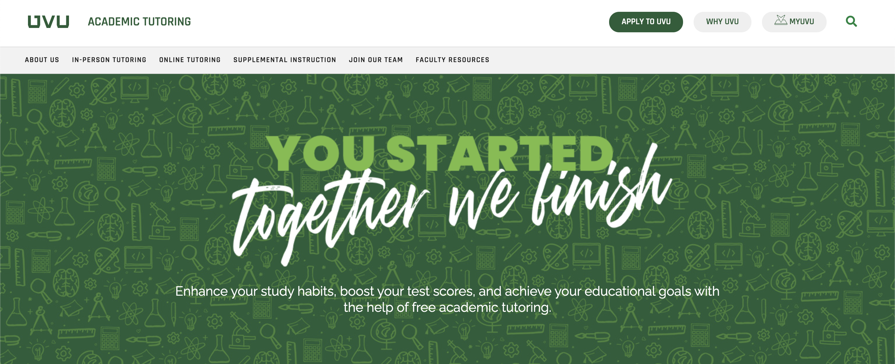
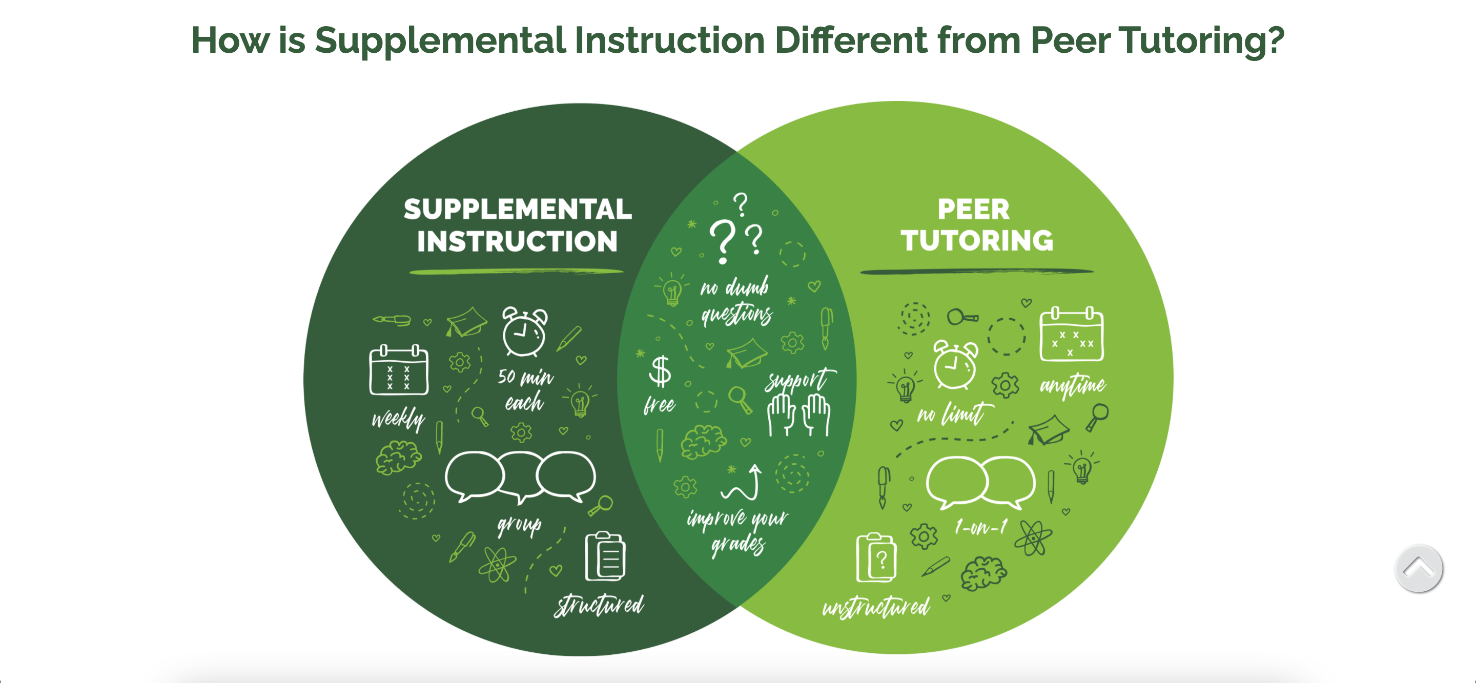
Each semester, Academic Tutoring hosts an event called Studypalooza.
The signage for this event, which was created before I joined the team,
features a background texture made of school-related icons. Since this
event garnered campus-wide attention in the past, the director requested
that I incorporate the icon motif in our new website.
A casual script font was used in combination with hand-drawn icons and
accents. The Jaeggers typeface was selected over other script fonts
because, as the font’s creator, Inspiratype, said, “It’s made to
resemble hand scratches, so it looks like a natural style—like your own
hand scratches.” The use of this typeface along with hand-drawn accents,
like an asterisk, resembles hand-drawn notes that a student might make
as they are exploring new concepts. Clear hierarchy
and clean design add professionalism to this whimsical style.
The “base” of each icon was outsourced to save time. Each icon was then
edited to maintain consistency between the icons throughout the site.
Sparkles were added to reflect our creative, fun atmosphere.
UVU’s primary color palette is forest green, black, white and metallic silver.
Per UVU’s style guide, a complimentary color palette of lighter greens can be
used with discretion in addition to the primary palette.
Since UVU uses pre-coded elements, we were somewhat constrained by what we
could include in the UI. Custom elements mean more work for the developer
and are not always approved. As this was the case, we edited these pre-coded elements to match our style by
adding hand drawn accents and using a lighter UVU-approved green. We also had to modify
some of our font selections at our developer's request and use UVU-approved fonts, like Raleway, that were similar
to the fonts we used in our brand identity.
Problem Solving
It can be difficult for a designer to view their own designs objectively. I
proposed user testing as a means of evaluating our designs to the director, but
he wanted to postpone testing until the website and other upcoming projects were
completed. After getting feedback from a few friends and family members, it was
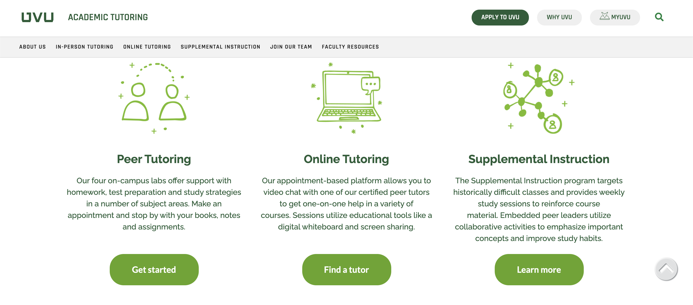
clear that the amount of content on the subpages (Peer Tutoring and Online
Tutoring) made the site feel cluttered. Important information was harder to find.
Some content was repeated on each page to maintain consistency, which resulted
in more clutter.
Since this was my first assignment of my first design position, I was hesitant to push the
issue. The director has a great eye for design and subscribes to high-quality
design content. Since he didn’t think user testing was necessary, I decided to
leave the issue alone.
A few months later, I still felt strongly that we needed to get feedback from our users. I drafted
a usability test plan
and researched several testing
platforms we could use. I pitched my plan to the director and this time, he was on board.
I contacted our developer about adding the code. The developer informed us
that UVU already had user testing protocols in place, but their web team was not
able to create a test for us at that time due to a high workload. When I checked
with my director again after a couple of months, he said that he liked the website
how it was and didn’t want to complete testing at that time.
After another month or so, several team members provided feedback about the website
which was in line with feedback I had received previously: the site felt cluttered
and some of the content was geared toward mid-management level positions such as
faculty or staff, rather than students. I communicated their feedback to the director.
By that time, I’d had some successes as an intern with other projects and felt more
confidence in my evaluation of our website. User testing was not approved, but a
second iteration of the website was given a green light.
Iteration
The second iteration is a streamlined version of the first iteration.
Repetitive content was removed. Content that was geared toward faculty or staff was
moved from the student pages to the Faculty Resources page or
deleted from the site.
Any content which was placed above essential information about
our services, such as hours and locations, was removed or placed lower on the page so
that the most important information was the first content to be seen by the user.
I would have chosen to remove some of the heavier green elements, such as the drop-down
tiles featured on the Supplemental Instruction page, to make the UI feel cleaner. The team
preferred to keep these elements in the second iteration.
I was able to gather some user feedback by external means. A project for one of my classes required
us to perform three rounds of user testing on an app or a website. I submitted a mockup
similar to Academic Tutoring’s website—one with a combination of images and icons, and
one with only icons. Feedback from 10 UVU students between the ages of 18 - 35 indicated
that the icons-only mockup was easier to navigate and felt more on-trend with current
designs. Based on that feedback, we removed all of the images from the website.
Lessons Learned
I learned so many valuable lessons as an intern at Academic Tutoring
that it is difficult to pick only a few. The most important lessons
I learned were these:
If I’m stuck on a particular aspect of a design, it’s time for me to talk
to the users—or review what they’ve already told me. User feedback
illuminates the problems with the greatest negative impact on the user
experience. If the fix for these problems is not readily apparent, which
it rarely is, feedback from users provides clues to the solution.
The last high-fidelity prototype I sent to the web developer was completed in
June 2021. View the live
website for Academic Tutoring.